
Over the past few years whenever I told somebody that I worked at a company that makes web archiving software, the next words out of their mouth were either: “What’s web archiving?” or (very rarely) “Wow! That’s amazing!” This experience summed up some of the challenges in branding the company: For a technical clued-in audience, web archiving software is pretty darn cool but for the rest of the planet it’s importance and utility is somewhat of a mystery.
When it became clear that we needed to upgrade our branding, my aim was to take the complex topic of “open source web archiving software” and make it look significantly more approachable.
Logos
Throughout the course of this project, I also served as Webrecorder’s UI/UX designer on Browsertrix: Webrecorder’s cloud-based web archiving platform. To get the ball rolling on the branding refresh, we contracted New York based designer Blake Duncanson to create some concept marks for all of Webrecorder’s actively developed user-facing software packages.
Blake was incredibly helpful and his work was instrumental in informing the direction we went with the rest of the marks. The ArchiveWeb.page, Browsertrix, and Browsertrix Crawler logos are pretty much entirely his concepts!
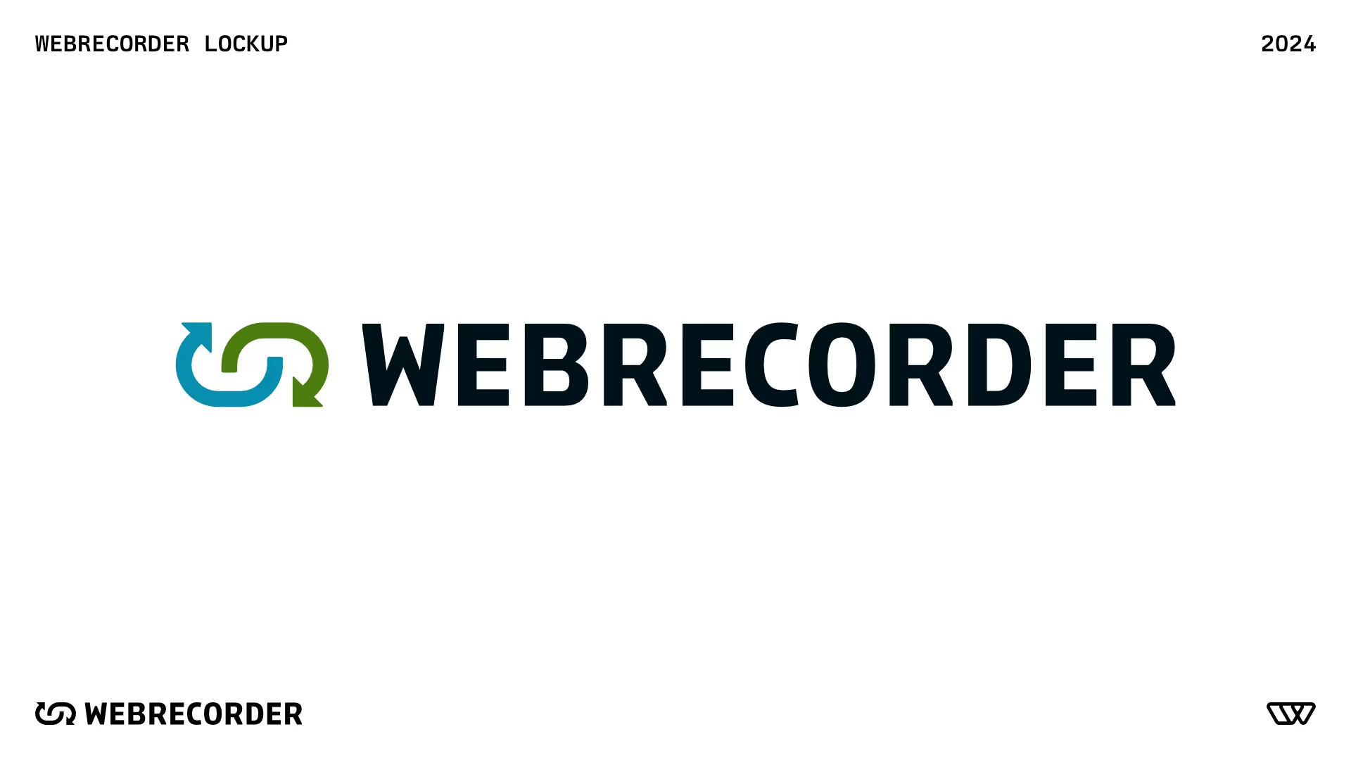
One of my top goals was that Webrecorder’s identifying marks should look like they belong to a cohesive set. To this end, I drew all of Webrecorder’s final app logos within a 96pt grid system, each using similar line weights, a 1pt corner radius to smooth out sharp points, and the same two-tone brand colours.
For Browsertrix (top left), we wanted to represent organization and parallel compute while also referencing the web browser’s UI with a navigation bar at the top and a content area below. Browsertrix is an application that integrates all of Webrecorder’s other software in some fashion and therefore is the only one made up of smaller rounded shapes. It’s a bit different than the other marks, the grid adherence is mostly at intersection points, but as Webrecorder’s core revenue-generating product we wanted it to be distinct!
ArchiveWeb.page (top right) takes the form of the end of the user’s fingerprint as they manually operate the browser to collect archived material, along with the shape of an “A”. ReplayWeb.page (bottom left) places the global network of the internet inside the common “replay arrows” symbol. Browsertrix Crawler (bottom right) — Webrecorder’s command-line capture software that powers Browsertrix — places an eye inside a “C” for “crawler”! 1
App Icons
ArchiveWeb.page and ReplayWeb.page can both be installed as desktop applications and Browsertrix can be installed as a progressive web app. All of these needed app icons!
I modeled, lit, and rendered these in Blender, my 3D package of choice, but had to take a trip over to Plasticity for the ReplayWeb.page globe due to some deficiencies with Blender’s beveling algorithm.2 Browsertrix’s goopy spherical connections were merged together with signed distance fields created using Blender’s geometry nodes!
Company Logo
Ilya really wanted to retain the existing arrow replay glyph from Webrecorder’s previous branding but I was initially pretty skeptical. It was difficult to fit into the square logo grid I had constructed that was working well for the other marks and I found the arrowheads challenging to balance on the top and bottom of the design.
After deciding to align the arrowheads at the 45° angle, the rest pretty much clicked into place! It felt good to land on a solution everyone liked after years of noodling around with different options and in the end retaining this element of Webrecorder’s identity was absolutely the right call.
A Note on Typography
We picked Elena Schneider’s Konsole as the organization’s primary display typeface. She says it’s still a work in progress, I say it looks pretty darn cool with vintage vibes, versatile width and weight axes, and lots of character.3
For body text we picked the tried and true Inter. Inter’s character set and OpenType features are hard to beat, it’s still my favourite neo-grotesque for UI. We used the ss07 squared punctuation stylistic set added in Inter’s 4.0 release to match Konsole’s square dots!
For monospaced text, we chose ArrowType’s Recursive: available as a monospaced (or not!) variable font with more going on than our display typeface! Recursive has a whopping four axes, though I typically made the most use of mono, which when set to 0.51, uses the monospaced character variants without actually being fully monospaced, a micro-typography bonus for legibility in specific scenarios where you want styling to match but don’t actually need characters to align in two dimensions! I wish more superfamilies would adopt this!
Colour
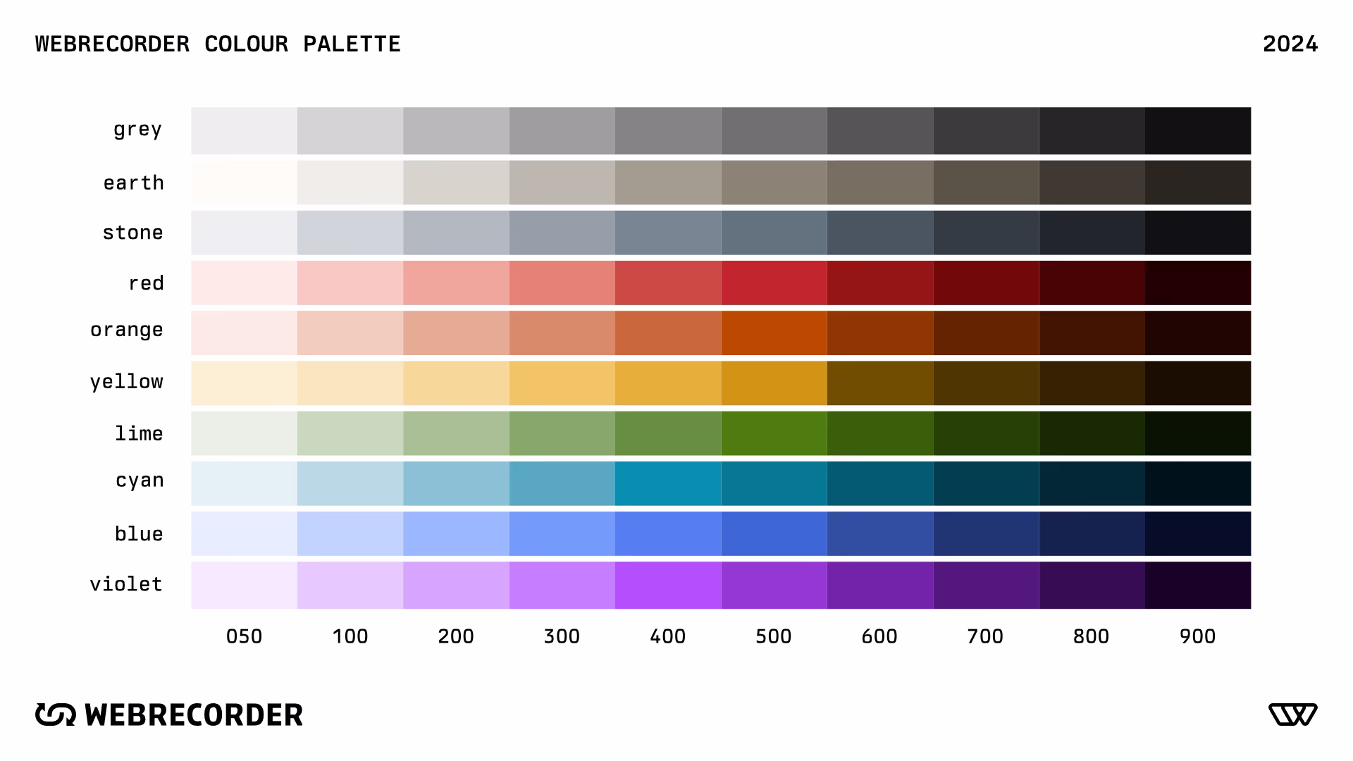
In addition to the cyan and green colours used in the two-tone logos, I created a full colour palette to be used across our site, apps, and other marketing material. This colour scale was mostly derived using Leonardo4 which provides a really great baseline and uses Oklch for for predictable “perceptual-like” colour interpolation. Webrecorder’s applications use colour semantically for warnings, errors, danger, success, and neutral states. It was important for us to retain cyan as a brand colour for theming our interfaces.
Want the values for yourself? Check em out in Webrecorder’s design system repo!
Illustrations
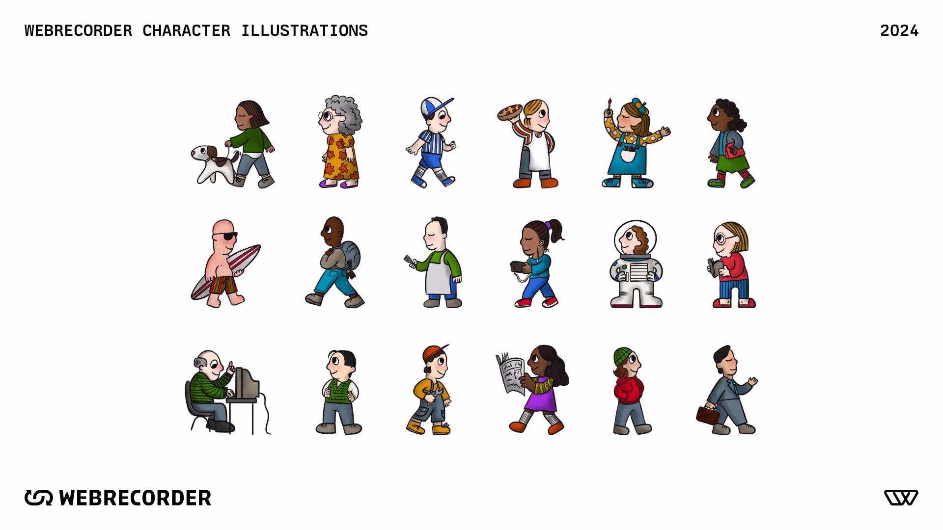
I can do a lot of things, but drawing isn’t my forte; fortunately I have talented friends! We worked with Toronto illustrator Alannah Astorquiza to create the characters and illustrated icons seen throughout the website. Alannah added the exact approachable feel we were looking for with a cast of cartoon characters to visually represent the “all” in “web archiving for all”.
Website
Prior to this website, Webrecorder’s web presence was somewhat scattered across multiple domains. Each site had a different structure, navigation between them wasn’t intuitive, and there was no overarching funnel for driving revenue. In addition to the brand redesign, we took this opportunity to overhaul all of our web content integrating all of Webrecorder’s tools, news, and educational resources into a single website with unified navigation. Emma, Sua, and I picked Astro for this site and jumped between Figma and prototyping with code where it made sense to do so.
Webrecorder makes web archiving software so hey, why not use it! Below you can browse an archive of what the site looked like as of my involvement.5
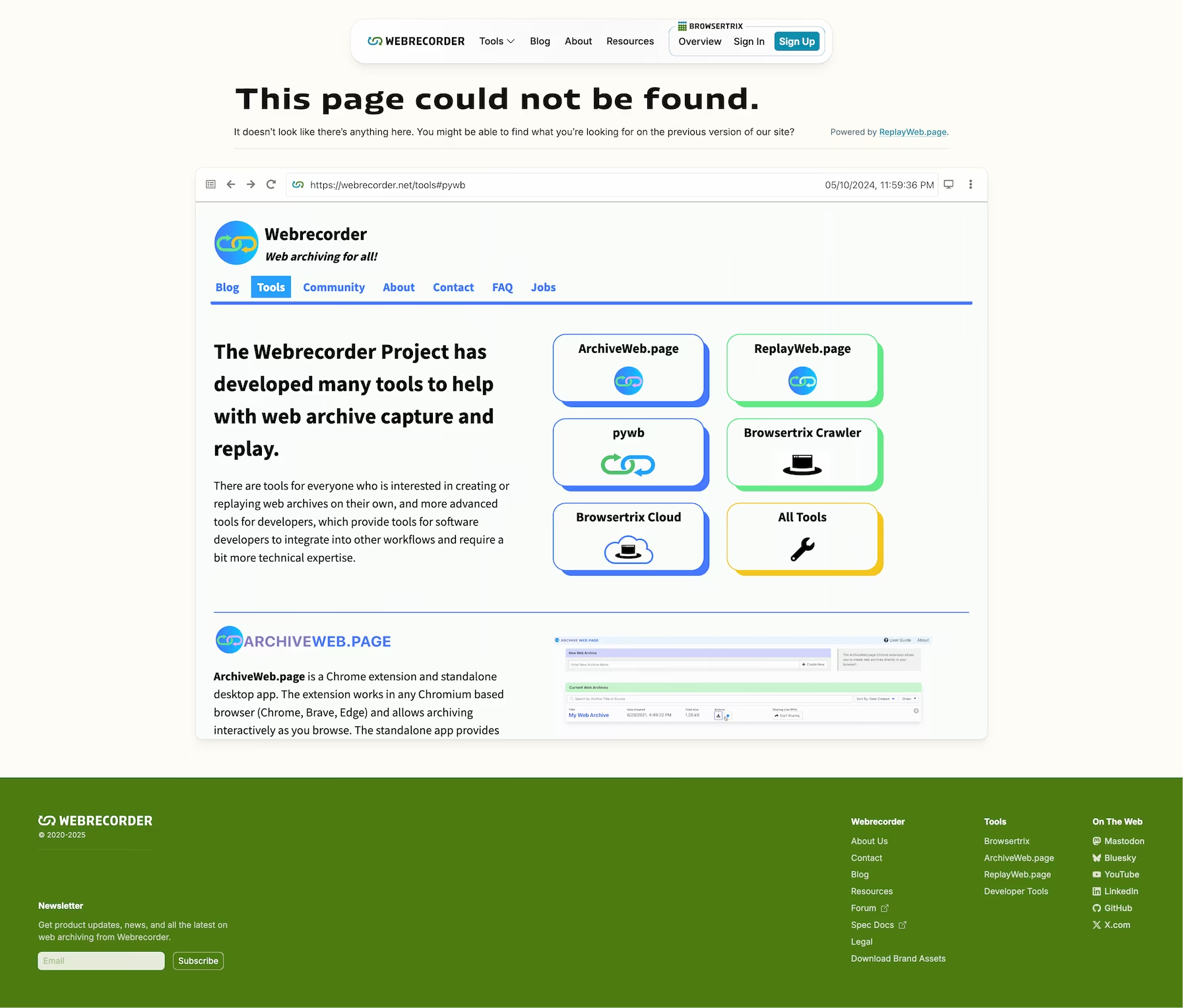
One thing that won’t work right now inside the archive above is, perhaps ironically, web archives! My favourite usage of them is on the 404 page where we redirect anything that might become lost over time to an archived copy hosted with Browsertrix.
Closing Thoughts
Branding and web design work is business infrastructure: The up-front costs of time and effort pay off every time somebody reads a blog post or learns about your company for the first time. Memorable and distinct iconography helps customers (both existing and prospective) identify and retain information about your products. You can have the best software in your product segment, but it’s a lot less useful if nobody can remember what it’s called! If I have one regret with this project, its that we didn’t start it earlier. Fixing the structural problems and unifying Webrecorder’s content under one site immediately doubled our web traffic (partially due to redirects), and created a measurable inflection point for improving search result discovery.
Hindsight is 20/20 though and all things considered I’m incredibly proud of what myself and the rest of the team at Webrecorder was able to pull off with our rebrand. Webrecorder is a company that punches far above its weight class, both in the quality and quantity of software they produce relative to the size of the team. It was a very rewarding journey to be a part of, and I’m excited to see where they go next!
If you’re looking for an all-in-one platform for creating and managing web archives, check out Browsertrix. I worked on it, it’s pretty good!
Footnotes
-
At IIPC’s 2024 conference where we revealed some of these updated logos to the broader web archiving community I was asked many questions about the meaning of each of them and subsequently promised a detailed blog post about our processes. I’m publishing this case study a little later than I’d originally wanted, but hopefully it suffices! ↩
-
I have been waiting eagerly for Blender to adopt the straight-skeleton algorithm for beveling first announced at Blendercon in 2022. Turns out beveling polygons is hard… ↩
-
Pun intended :) ↩
-
Leonardo (as of 2024) is a mostly great tool but doesn’t entirely meet my needs. There is no way to lock in individual stops and interpolate between them. If you’ve found a tool that does this and interpolates using Oklch, please get in touch! ↩
-
I would love to see more web designers and developers implement web archives into their portfolios! Even if Webrecorder changes the site or it goes away entirely, I’ll still have this copy! For more information about embedding web archives into your own content, check out ReplayWeb.page’s embedding guide. ↩