I’ve been involved with Toronto Mesh since 2017 and up until recently branding hasn’t been a terribly high priority. The same seems to be true for community networks in general, at first glance most of them don’t seem to have the same branding capabilities as their for-profit counterparts. Some of this is to be expected, after all community networks are defined by the people and technology they are composed of — perhaps designers aren’t drawn to them in the same ways that they aren’t typically drawn to the open-source community. As of 2021, most community networks and mesh-centric community groups do not have established sets of brand guidelines — at least not ones that are publicly available. With the creation of these my goal was to set a new standard for what outward-facing material from these organizations can look like and give further credibility to community networks overall.
Logo
For this brand I wanted to avoid any explicit references to the wifi logo which is the obvious first image that comes to mind when thinking of wireless networking. Toronto Mesh is seeking to build a community network, not just give away free wifi. The logo system comprises a typographic logotype as well as a logomark, both of which share the same overlapping circles with randomized colours inspired by the overlapping nature of mesh networks, dot matrix printers, and the many multifaceted community driven approaches to building networks in the commons. The logotype should be used wherever possible whereas the logomark should only be used in places that the full logo isn’t well suited for. Both logos can have their colours randomized on use for added variety.
While still making use of the same dot-matrix inspired aesthetic and colour palette, the logomark is significantly more abstract. It does contain a nifty easter egg however! When the absent spaces and filled circles are interpreted as binary (absent=0, filled=1) and converted to ASCII characters, the logomark actually spells “tomesh”. Neat!

Dithering

From the beginning I wanted to use this project as an opportunity to investigate methods of conforming images to fit an organization’s branding. Lots of brands already do this with patterns, overlays, filters, and with duotone colour processes, but none of these approaches seemed to be the right fit for Toronto Mesh. Inspired by the dithered duotone treatment used by Low-tech Magazine’s solar powered website I decided to do a deep dive into dithering.
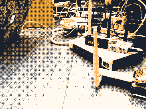
To create these images I worked with Cole Anthony Capilongo to define a standardized dithering process that can be applied to any input image with minimal creative adjustments needed. This process involves bayer matrix dithering with a 4 colour linearized greyscale palette to ensure that any sRGB encoded image can be filtered properly. If we were to dither the image directly with the coloured palette any image with colours that are close to the brand colours would become biased towards them, dithering with greyscale first and then replacing the palette with the desired brand colours as a post-process ensures that they are evenly spread throughout the image based on luminance alone.
Unfortunately no previous tool existed that could do all these steps within one program and I’m thankful that I was able to get Cole to build the colour palette replacement feature into Didder, his command-line image dithering application. I highly recommend that you check it out if you’re into this kind of image manipulation, it is by far the most advanced dithering program I’ve ever come across and it’s capable of much more than I’ve used it for here!
Additional details and a full description of how to accomplish this specific image filtering technique are available in the brand guidelines document, while instructions and commands for Didder are not present in this version a close read of the man pages should give you all the information you need to replicate the process! Note that you may need to adjust the strength of the Bayer matrix to achieve the results shown here, somewhere around 40–50% is usually about right.
Brand Guidelines & Typography
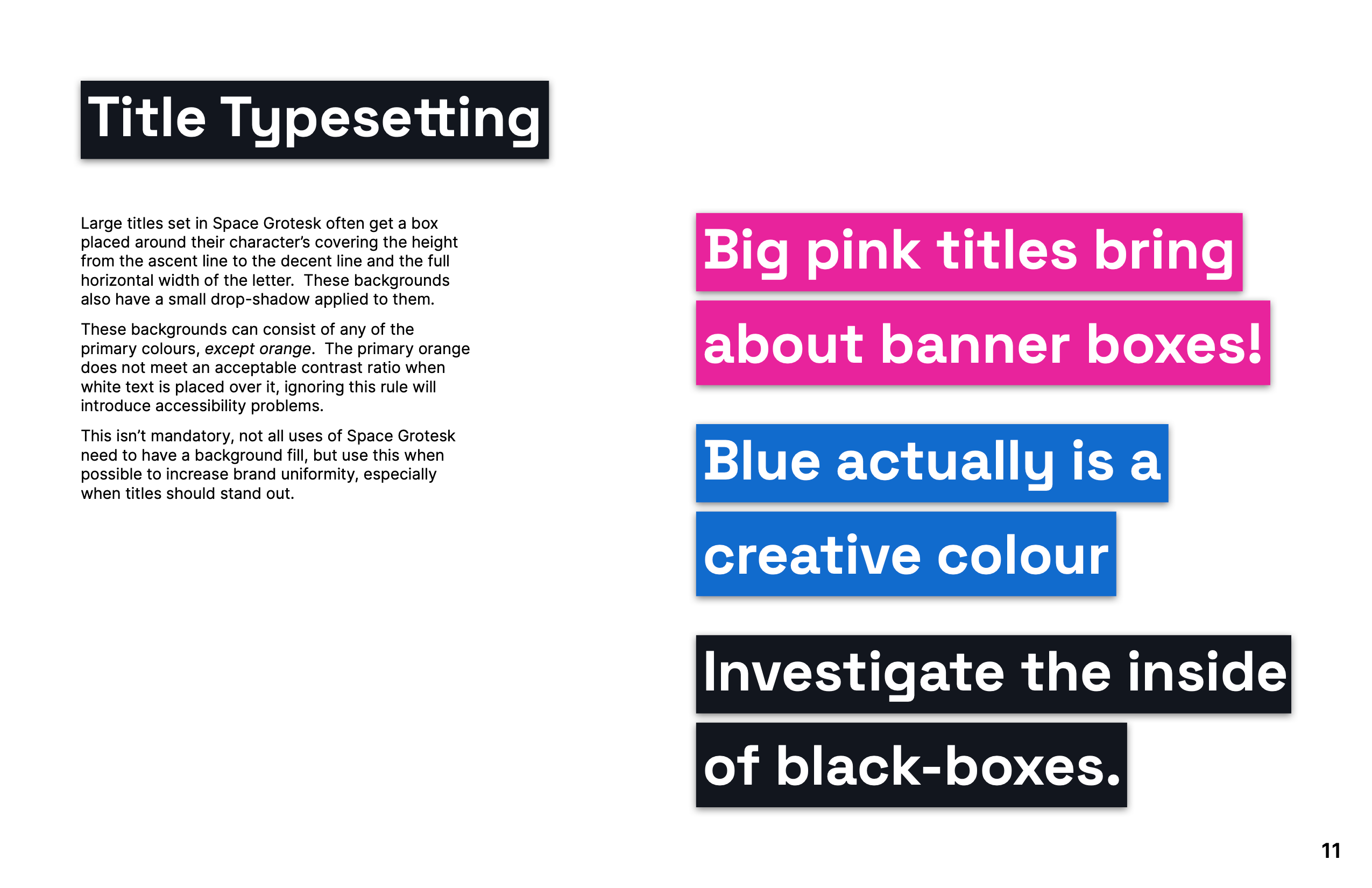
Every good brand is backed by a robust set of guidelines! This document covers everything from logo and colour usage to defined typesetting styles for titles. Being a community group based around open-source it only made sense for Toronto Mesh to use open-source typefaces! I selected Space Grotesk for titles and display use cases, and Inter for body copy (and pretty much everything else). Inter is quite a neutral choice on the surface but its large character set and great Opentype feature support makes it a compelling one… In my opinion anyways, there are certainly edgier fonts out there!
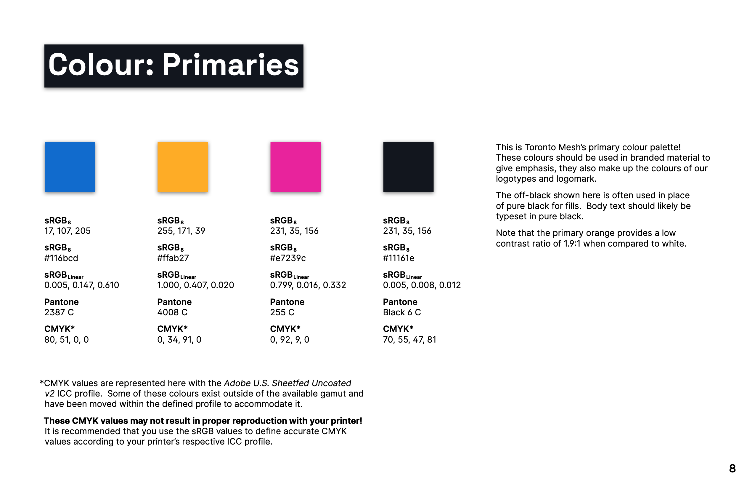
Colours are defined in a myriad of ways including both 8-bit sRGB and linearized floating-point sRGB. I’ve never come across other guidelines that do this and have had many scenarios working in applications that only accept linear values where I have wished that these just be made available officially. I firmly believe that designers should have minimal interactions with colourspace converters when implementing brand colours.
Download the full brand guidelines document for a more in-depth look!
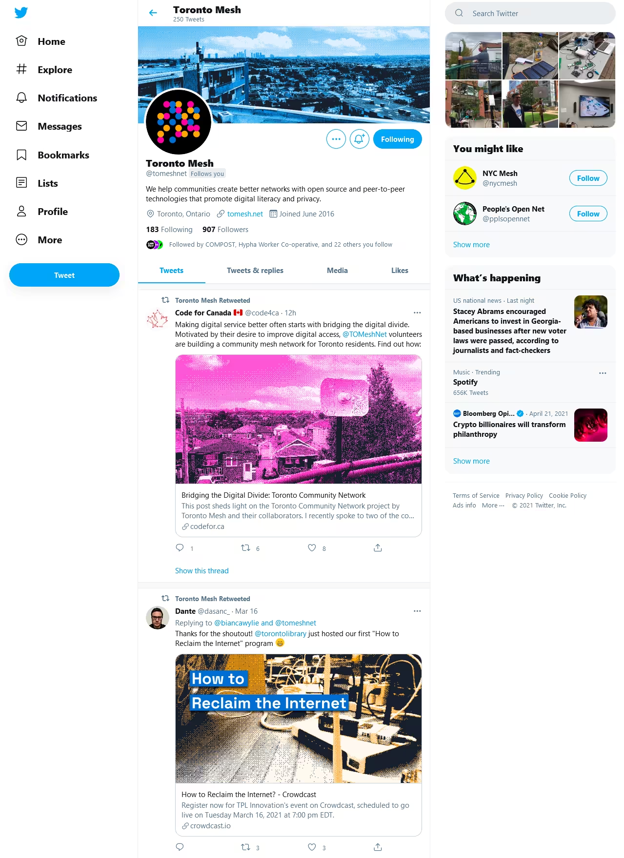
Usage Examples


Future
Currently this project has not been implemented, I plan to update parts of this based on initial feedback from Toronto Mesh members and (assuming it gains widespread approval).
