Passive Buildings Canada is a Canadian non-profit focused on education and support of the Passive House sustainable building construction standard. During my time with the organization I created an updated brand with new logos, typefaces, and colours, as well as an overhauled website built with Wix’s Editor-X.
Brand
I was originally hired for the sole purpose of replacing Passive Buildings Canada’s website which was originally created with an aging platform that offered few opportunities for customization and future growth. The first problem I ran into with this process was the existing branding, it just wasn’t versatile enough for their use cases. Creating an emblem is fine but having it as your sole logo introduces legibility difficulties at small sizes and can be entirely unrecognizable when used at extremely small scales like in a favicon. The existing brand colours also didn’t meet my contrast standards over a white background (Fails APCA unless the text is gigantic).

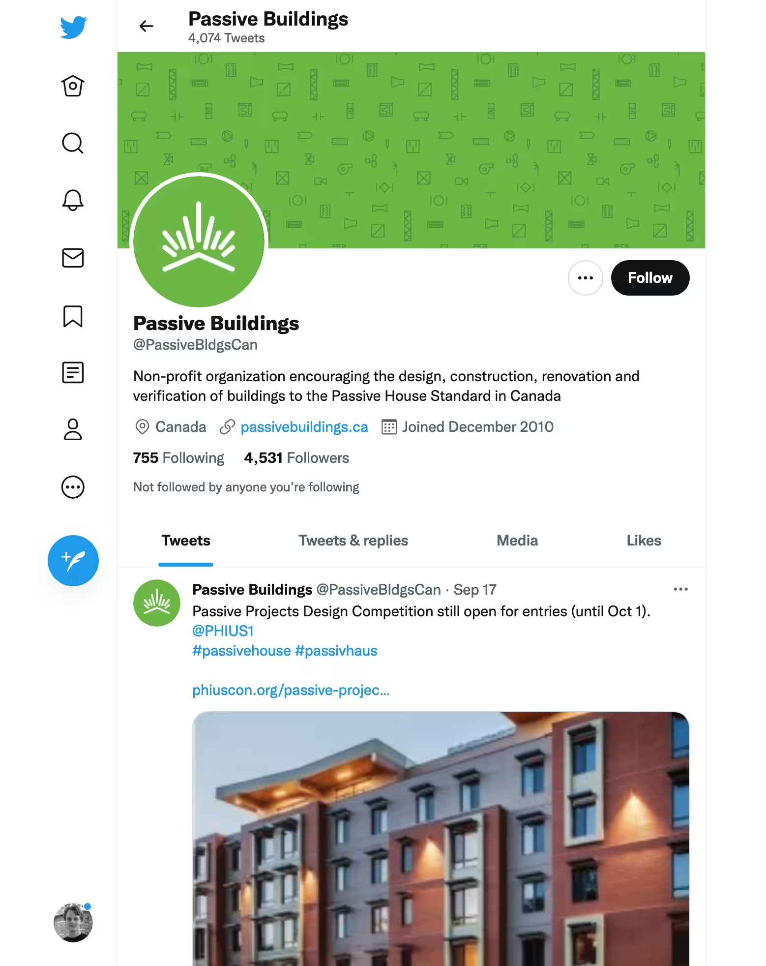
The new mark is bolder and features higher-contrast brand colours. It borrows from the original emblem in order to stay recognizable but updates the radiating maple leaf with better geometric alignment and thicker lines for improved legibility at smaller scales.
The rebrand features two new options with text to be used as space allows.

Alongside the logo I created a brand pattern using HVAC related architectural plan symbols. Passive Buildings Canada mainly deals with architects, building suppliers, and engineers. While these symbols might not resonate at first glance with the general public, they should be instantly familiar among Passive Buildings Canada’s core demographic. This pattern can be used as a background fill pretty much anywhere to add an extra branded element that is unique to Passive Buildings Canada.

Website
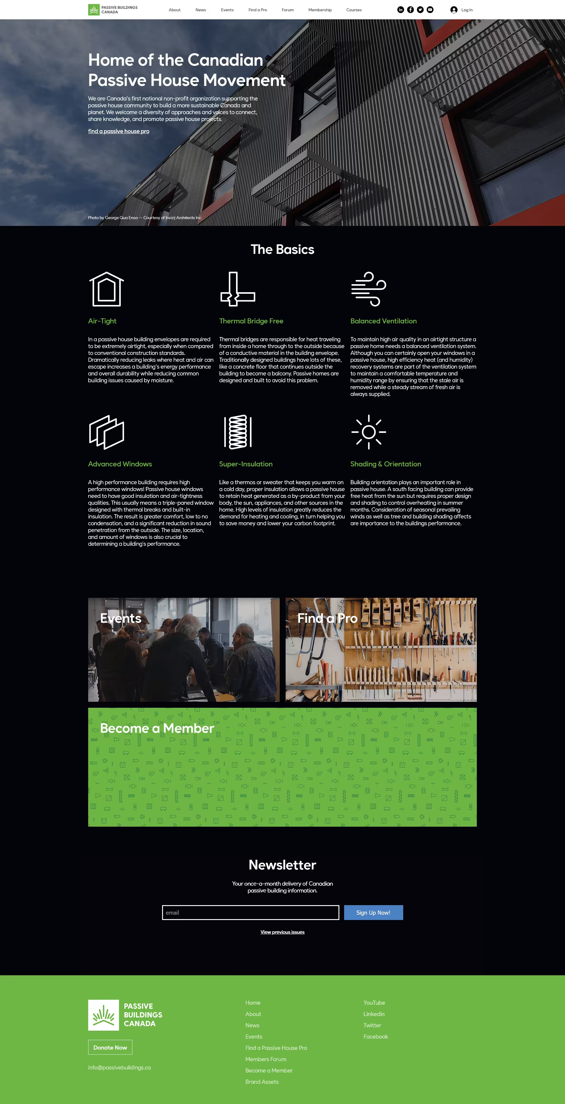
Whereas the previous website was largely just a list of members, Passive Buildings Canada’s new website puts more emphasis on member engagement and education. Existing members now have access to a forum and new users actually get to learn a little bit about passive house construction right on the homepage (something that was curiously missing from the previous website).

Passive Buildings Canada’s previous website was built using a web platform called Brilliant Directories. While the system is far from its namesake it does accomplish the goal of letting people pay to be listed on a website. Wix unfortunately does not offer a built-in feature that replicates this function and seeing as it was a previous membership perk it would be unreasonable to not bring that over to the new website. Using Wix’s JavaScript API we were able to create a system that worked alongside Wix’s form submission tools to check if membership was active before enabling member’s profiles on the “Find a Pro” page shown below.

Gripes & Shortcomings
While I am satisfied with my final results overall, I would not use Editor-X again unless it seriously improves in every area. I constantly ran into roadblocks with both their layout tools, JavaScript API, and styling abilities — as of 2021 you still cannot add text-shadow to text or manually set the object-fit mode of images. Every single graphical website builder I have ever used has held me back in some way and I find them all frustrating compared to writing my own markup and CSS. Editor-X is especially terrible in this regard, it was chosen by the organization solely for its easy CMS management (once the website is built anyways) and specific site membership perk systems.
To Wix’s credit, their new editor is… well, still very new. At the time of creating this site it was still officially in beta! Normally I wouldn’t use beta software to actually run production websites but seeing as their original editor has no responsive design support and will likely be deprecated at some point in the future with Editor-X becoming the new default, I think it was the right choice for future proofing. I hope it evolves quickly and catches up with the competition!
In the meantime, if you don’t need Wix’s other features and you’re looking to make a website graphically Webflow would be my recommendation as of posting. They don’t let you do everything with their tools but at least they allow you to work around them with custom code where required and their editor is quite a reasonable front-end for styling elements.

