When 3D artist, animator, and girlfriend Liza Desyatkova mentioned to me that she wanted to make a magazine I was pretty immediately on board! I always love a good diversion from my usual problem space of tech, and any excuse to teach somebody about the importance of paragraph styles and margins is always a fun opportunity.
Table of Contents
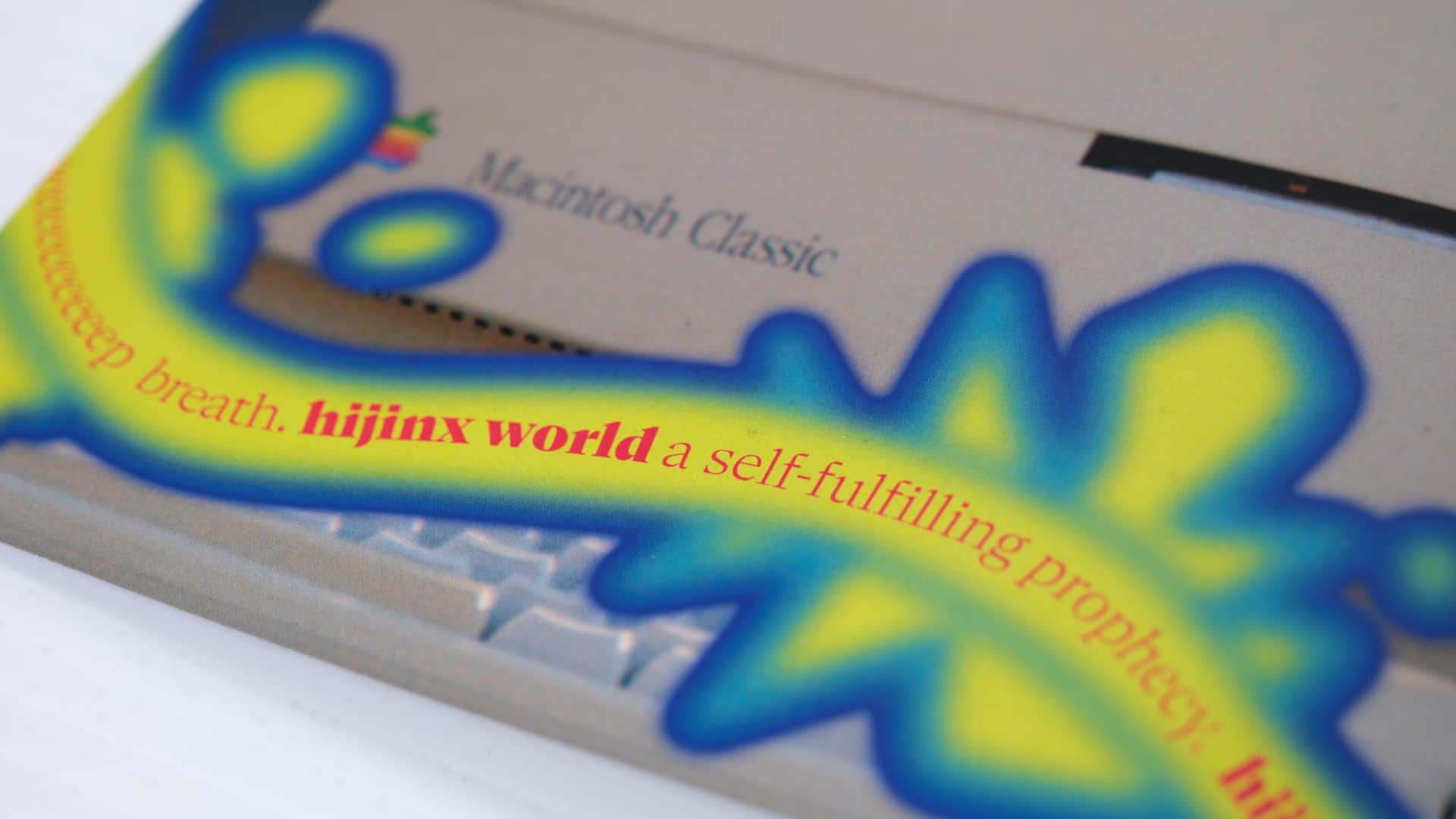
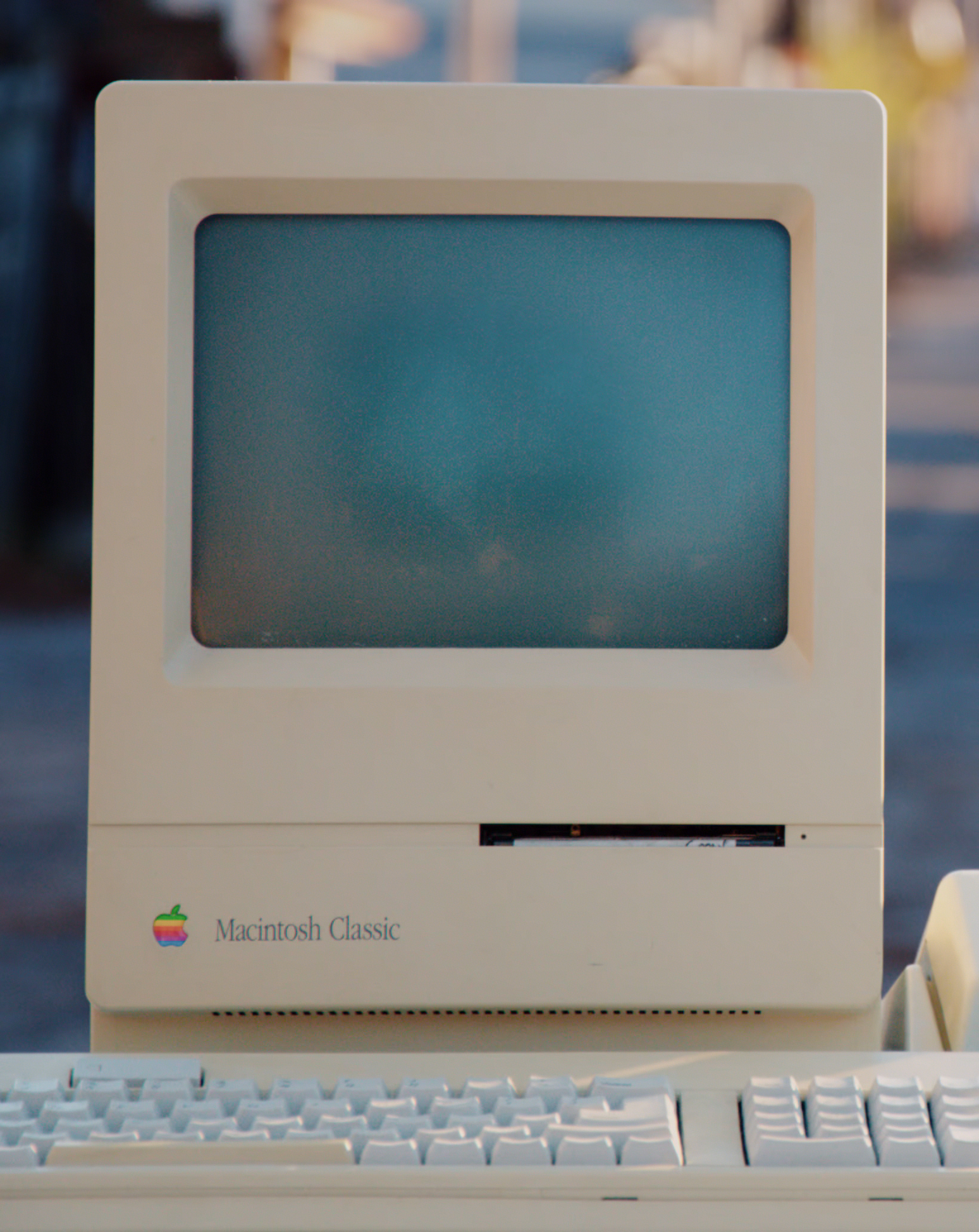
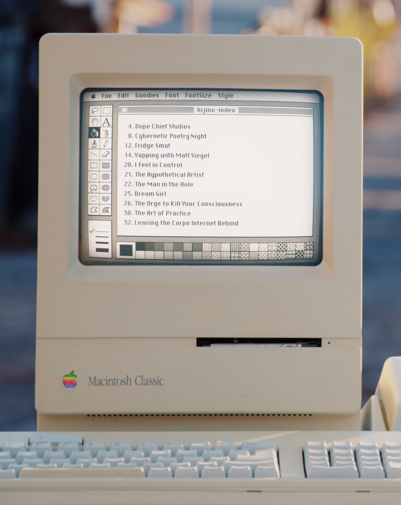
The idea for this spread came from Liza after she found an old post on my Instagram from a photography class I took in university. She figured it would be cool to turn on the Macintosh and display the table of contents on it. I did a lot of monitor comps on AMC’s Moonhaven and I keep a robust archive of my past work so hey, how hard could it be?
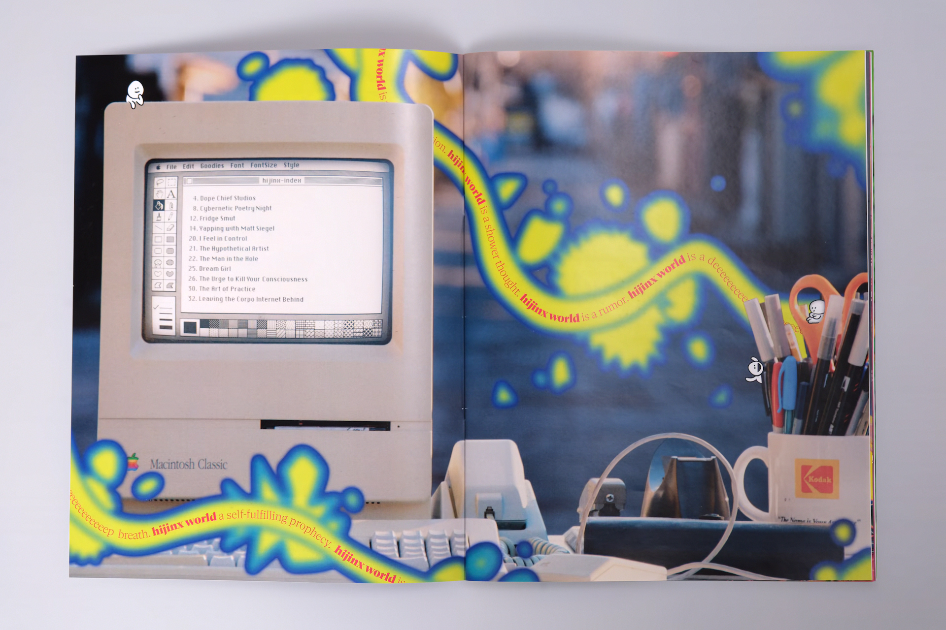
If there’s one thing I hate in movies and TV it’s poor attention to detail with regard to computer interfaces. For this one I loaded up MacPaint 1.5 in the Internet Archive’s emulator, typed out a text specimen of all the characters in the Chicago typeface, and took a screenshot at the original resolution to get the initial capture of the screen. The text was all manually typeset by moving the glyphs around in Affinity Photo — Chicago (the bitmap system font used by the Macintosh) didn’t have kerning tables as we know and enjoy them today — which was a somewhat laborious but ultimately rewarding process. After compositing the final screen into the original image with proper tube distortion, reflections, and chromatic aberration in Nuke I sent the final image to Liza so she could add the rest of the gradient elements along with her “hidden people” illustrations (which can be found throughout the magazine).
Selected Magazine Bits
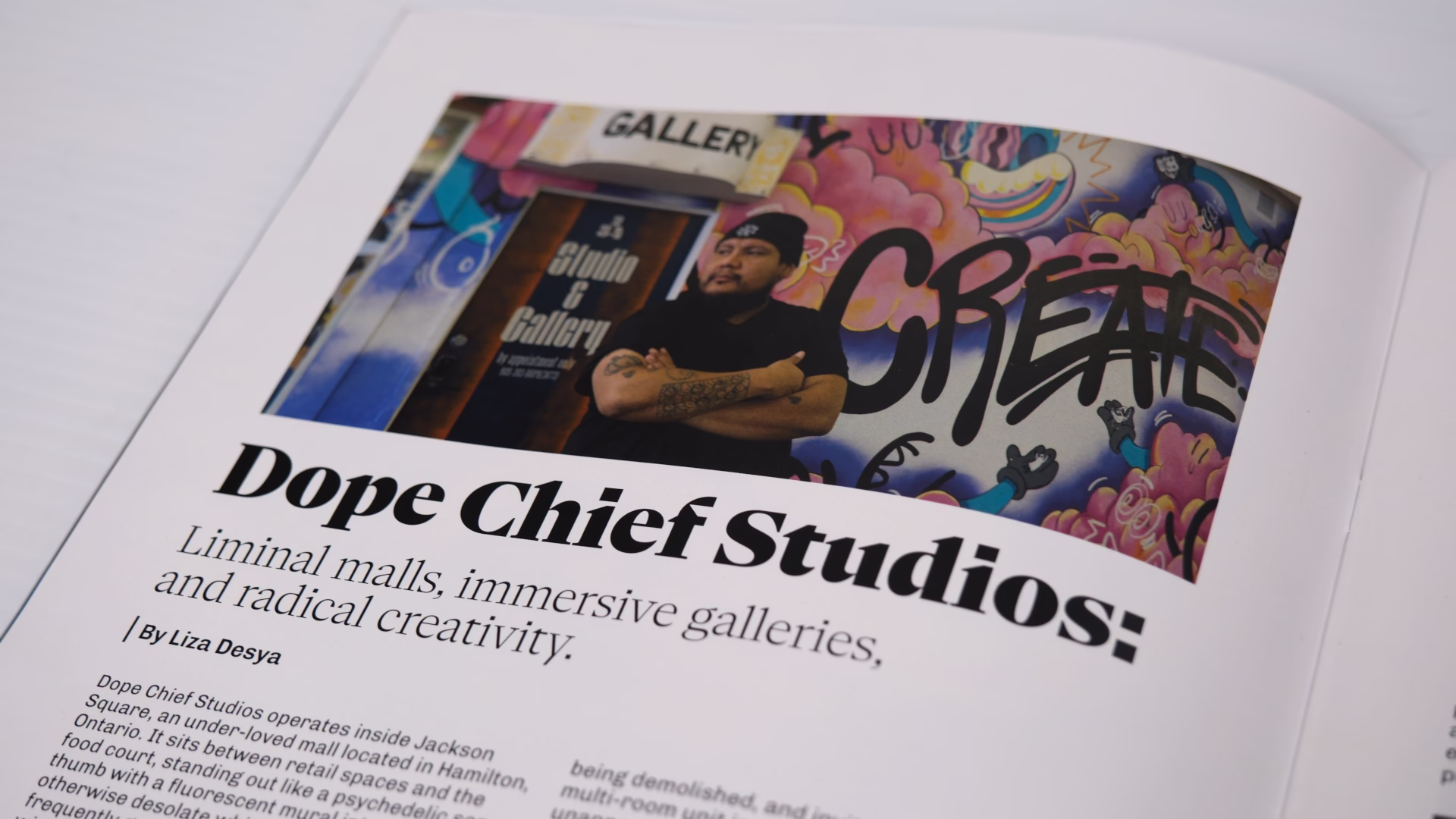
Liza profiled Dope Chief, a local artist from Hamilton Ontario. Dope was kind enough to let us hang out in his studio for a few days before printing to finish everything up!
NaN Serif A was used for article titles whereas Chivo was used for body text. NaN has an incredibly reasonable and very cool student bundle that allows for small-time commercial use of their fonts after graduating. If you’re currently in design school I highly recommend checking it out!
I’m fairly proud of everything we accomplished together and how far Liza has come with her layout skills since I met her and started giving her nitpicks. She did a ton of work to get this project out the door. In total we created seventeen spreads!
If you’re looking to pick up a copy for yourself, check out shop.hijinx.world.