Well, I hope not… But I’d also like to think that I’ve learned a few new things over the last two years, and I was really excited to apply some of them when Hypha approached me with the general pitch of a retro-futuristic brand for their new video podcast series. Armed with a Nuke license and additional knowledge of obscure computer graphics hardware from the 1980s I set out to apply what I wish I knew in 2020 to the CG line art aesthetic — this time in proper 3D!
Concept
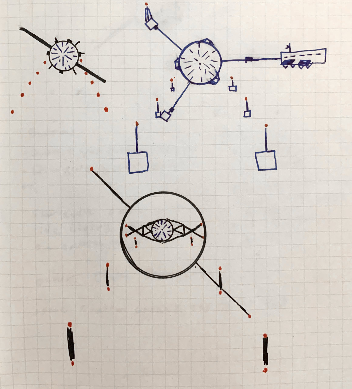
I began this project by creating a mood board of cassette futurism inspired images based on the project brief and initial call I had with Hypha. After the direction was wholeheartedly approved, I created some initial sketches and a rough animatic of the intro sequence.
“Hey! This kinda looks like the ‘O’ in the Cosmos logo! Maybe I should flip it and actually make that intentional…”
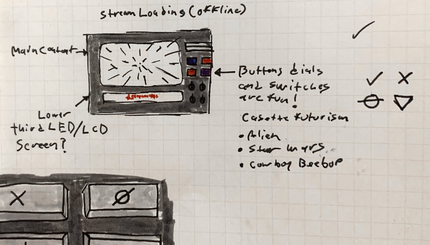
This crummy prototype was created as a proof of concept in about a day. I really like Mike Diva’s approach for concepting projects, the process being: create the crappiest pre-vis version as fast as possible to get things out of your head and test if they will work for real. Then move forward knowing that what you want to do will work or change it accordingly. The point being, don’t judge my sub-par drawings too hard. ;)
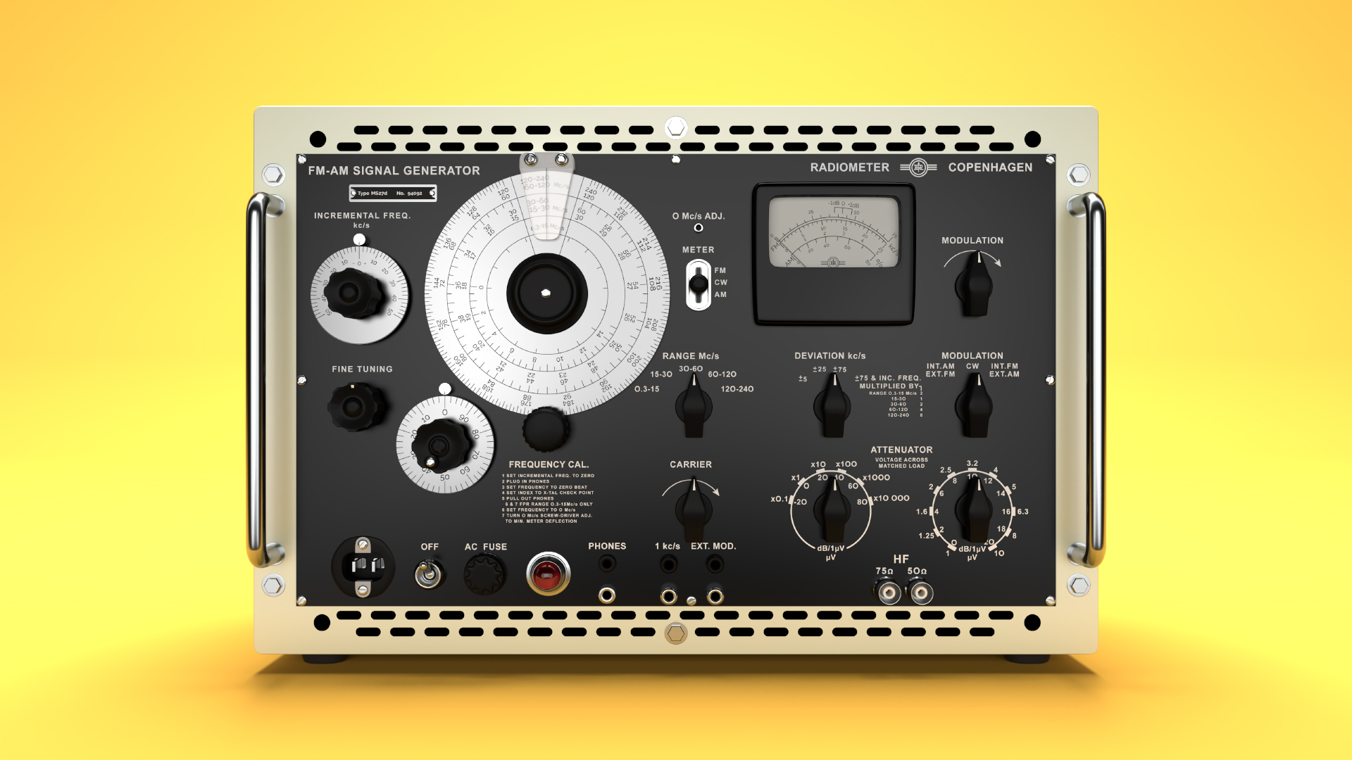
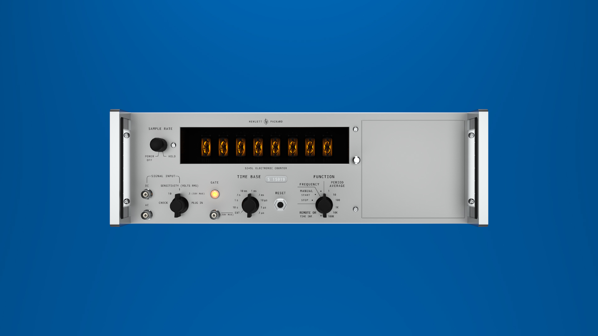
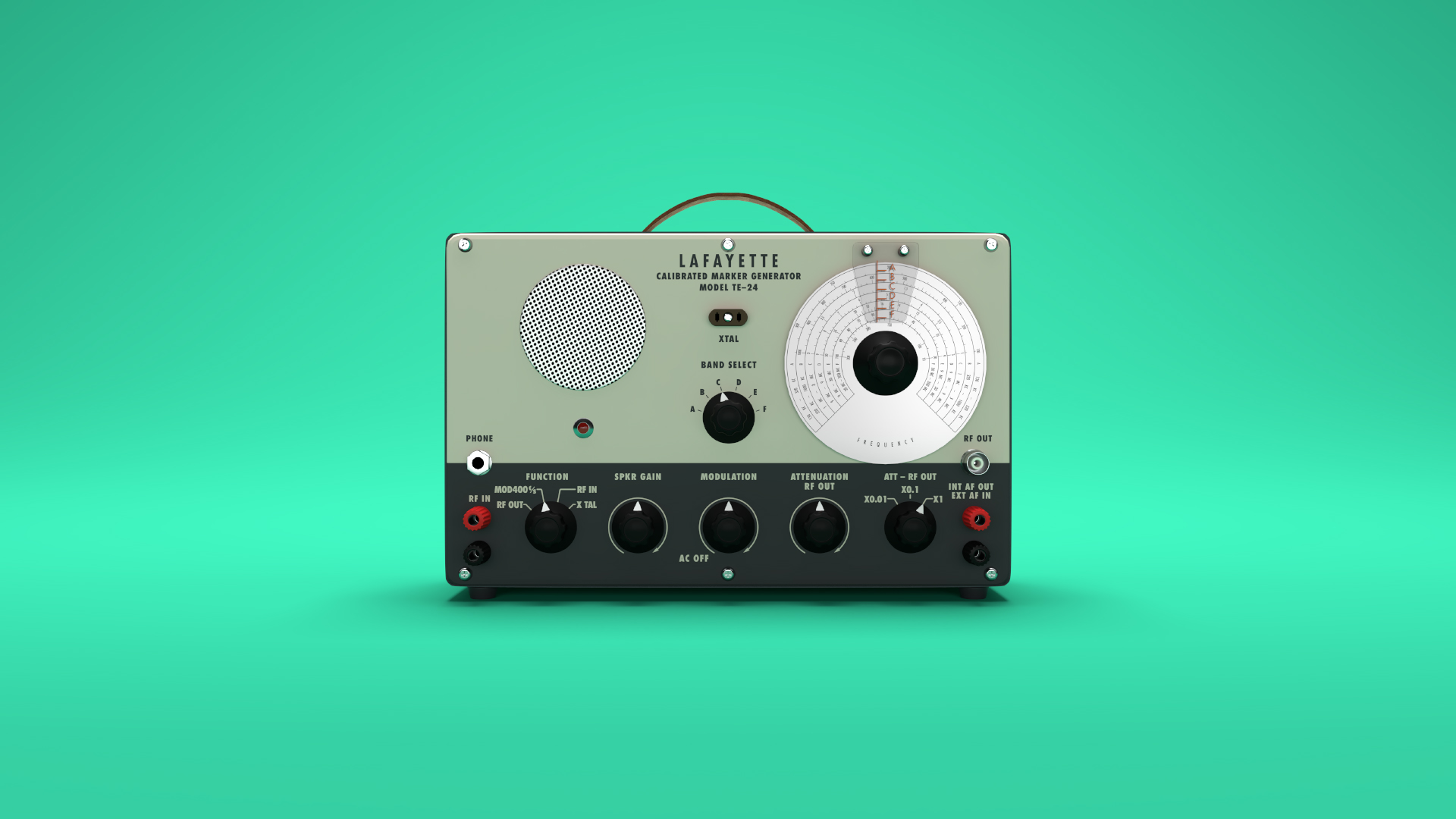
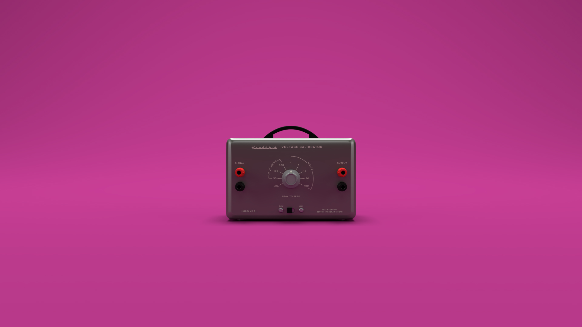
Final stills
Type
This project makes use of Jura and Vectrex. Vectrex was an obvious choice, it’s based on the characters from vector displays and is made entirely of monolinear strokes making it a perfect fit for the rest of the CG line art elements. I can’t any take credit for finding it though, for that 100 points goes to my friend Valery Marier for pointing me in the right direction! Val is very cool and she knows her typefaces.
Jura is a slightly more technical choice. I wanted something similar to Eurostyle (the retro-fusturism classic) that looked like it could have lived on old electronic equipment. I also wanted a typeface that Hypha’s members could use without worrying too much about licensing issues. I’m a big believer in using boutique fonts for display purposes and you’ll get no complaints from me about compensating typeface designers for their work — unfortunately Hypha has no full time designer on staff who can coordinate licensing and so I have set up the organization to use Jura for all show related material that doesn’t consist of graphics that I’m making in order to mitigate licensing issues. That’s not to say I would have necessarily opted for another typeface had I not found Jura however, I think it’s aesthetically compatible and delivers a reasonable range of typesetting features! It also has an ampersand… Something that cannot be said for Vectrex. 🙃
Branding
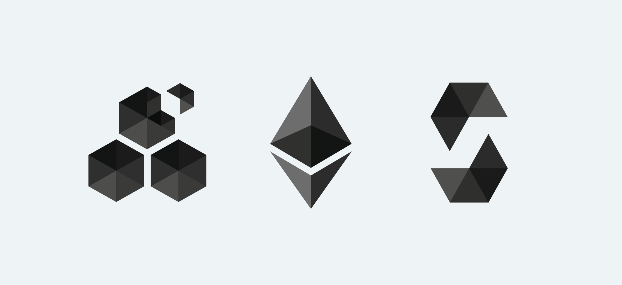
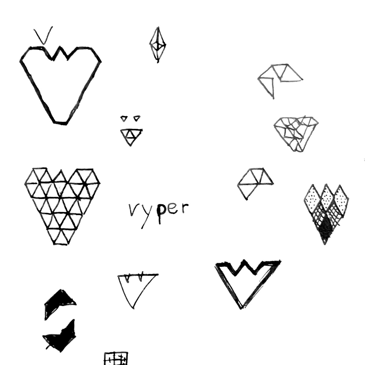
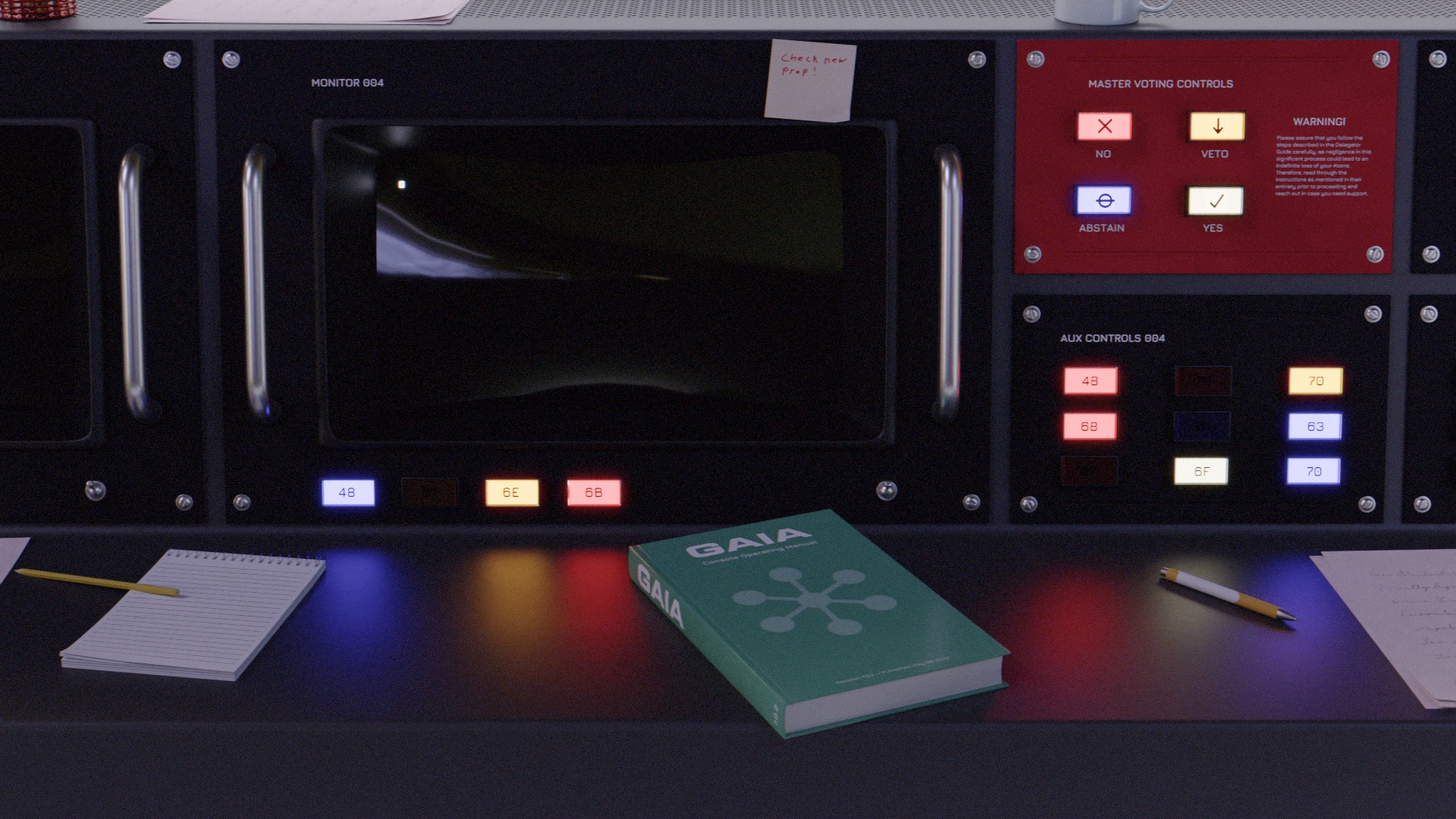
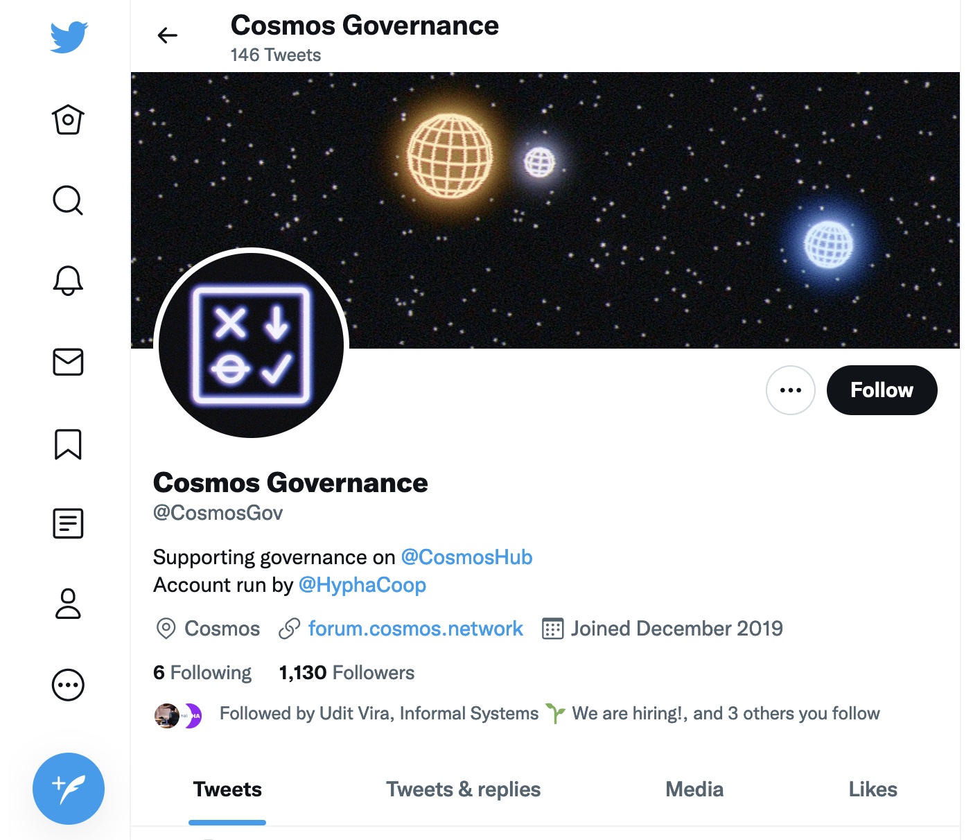
While What’s At Stake was set with its funky Vectrex logotype, a bigger question remained for @CosmosGov which also needed a new coat of paint: How does one create a symbol that embodies the concept of “governance”?
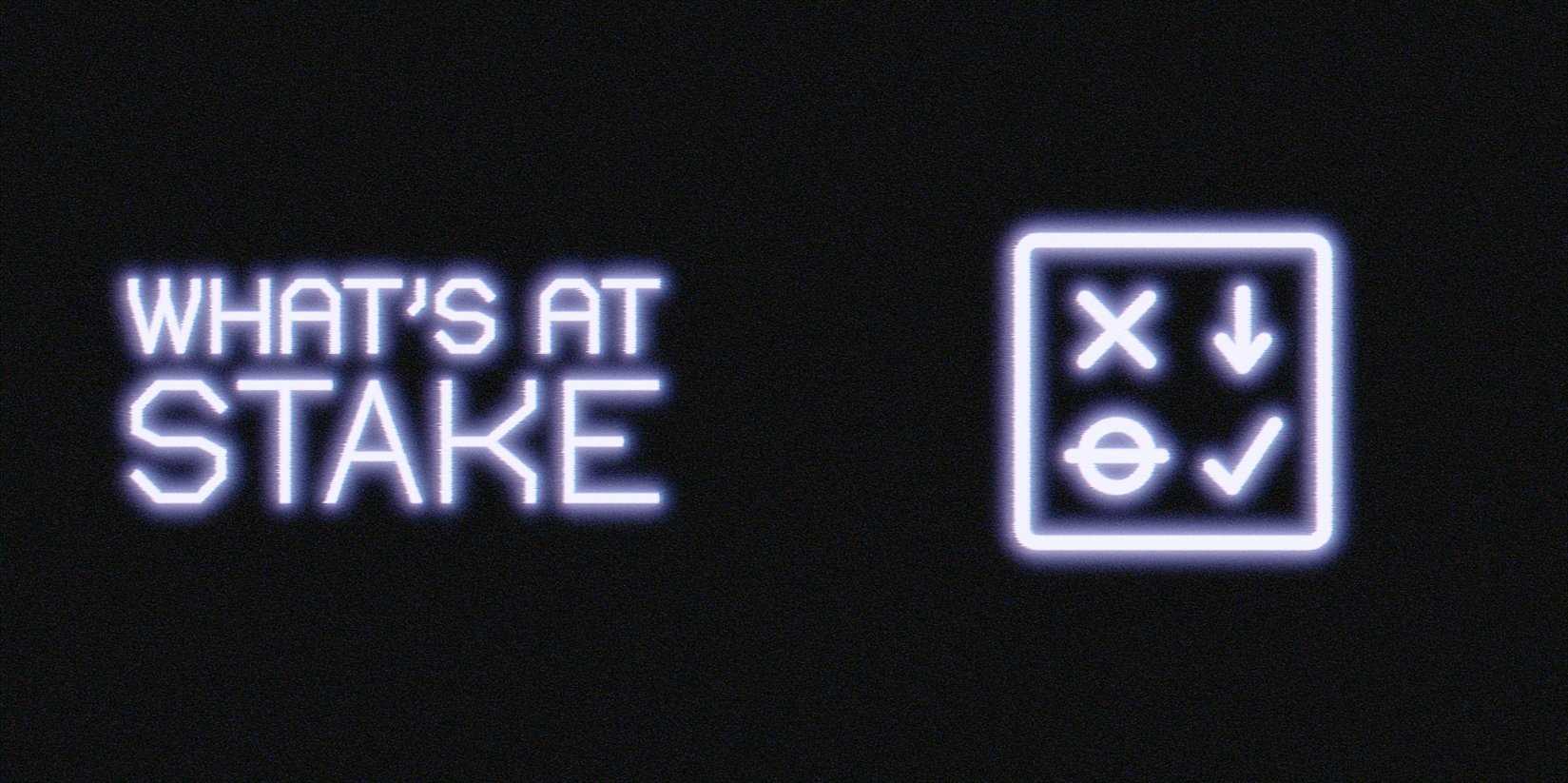
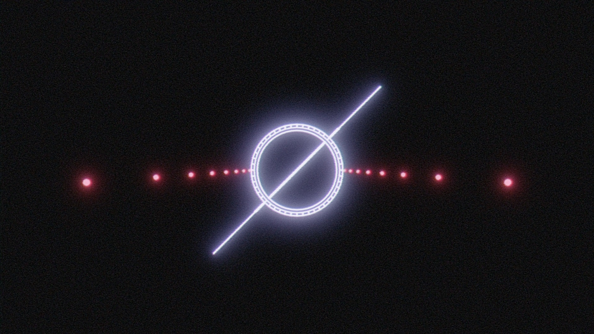
I ended up drawing upon Cosmos’ voting system for proposals that change how the network operates. When voting on Cosmos proposals, stakeholders have the options of: Yes, No, Abstain, and No with Veto. While “No with Veto” is probably the most difficult option to create an icon out of, I think the other 3 are all reasonably recognizable among the crowd the mark is aimed at. The retro glowing line art aesthetic is used across both to tie them together.
Process, pipeline, and technical information
A while ago I switched from Maya to Blender as my primary 3D content creation application. That decision has since paid off immensely! One of my reasons for doing this was the amount of community created resources & tools that exist for Blender — the volume of which I haven’t seen matched by other packages (maybe Nuke?). Having these resources available as a one man operation is huge. $10 on Gumroad can save a lot of time.
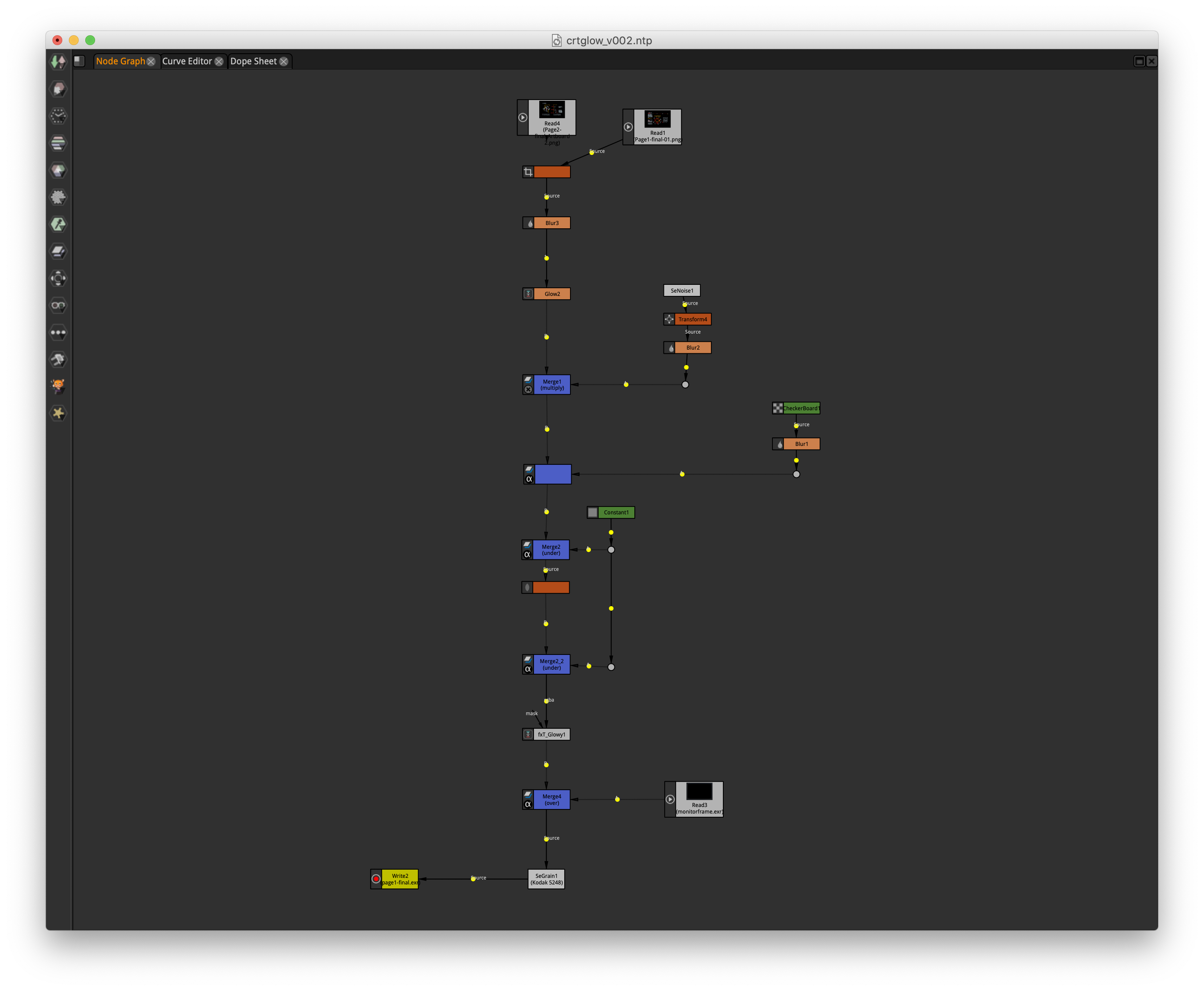
This project made use of MRMO-CRT, a lovely looking CRT shader created by Stefan Bogdanovic. I’ve created shaders in Blender that replicate display technology before, but this one seemed to do a great job at mimicking most of the characteristics of CRTs, for the most part I recommend it highly! The one somewhat inconvenient issue posed by the version of the shader I used is that it makes use of Blender’s Shader to RGB node which only works in the Eevee render engine. All shots with the CRT in it were rendered in two passes, one of just the screen in Eevee, and another in Cycles with an emissive, reflective material that wasn’t visible to camera rays but was visible in bounce lighting to get the accurate reflections from the monitor.
This is also a notable project for me because it marks the first freelance job where none of the content has been created with an Adobe program. I’ve been mostly enjoying Serif’s Affinity suite and while there are some tools that I miss, I’ve largely been having a good time expanding my workflows with new programs and their different approaches.
Freestyle
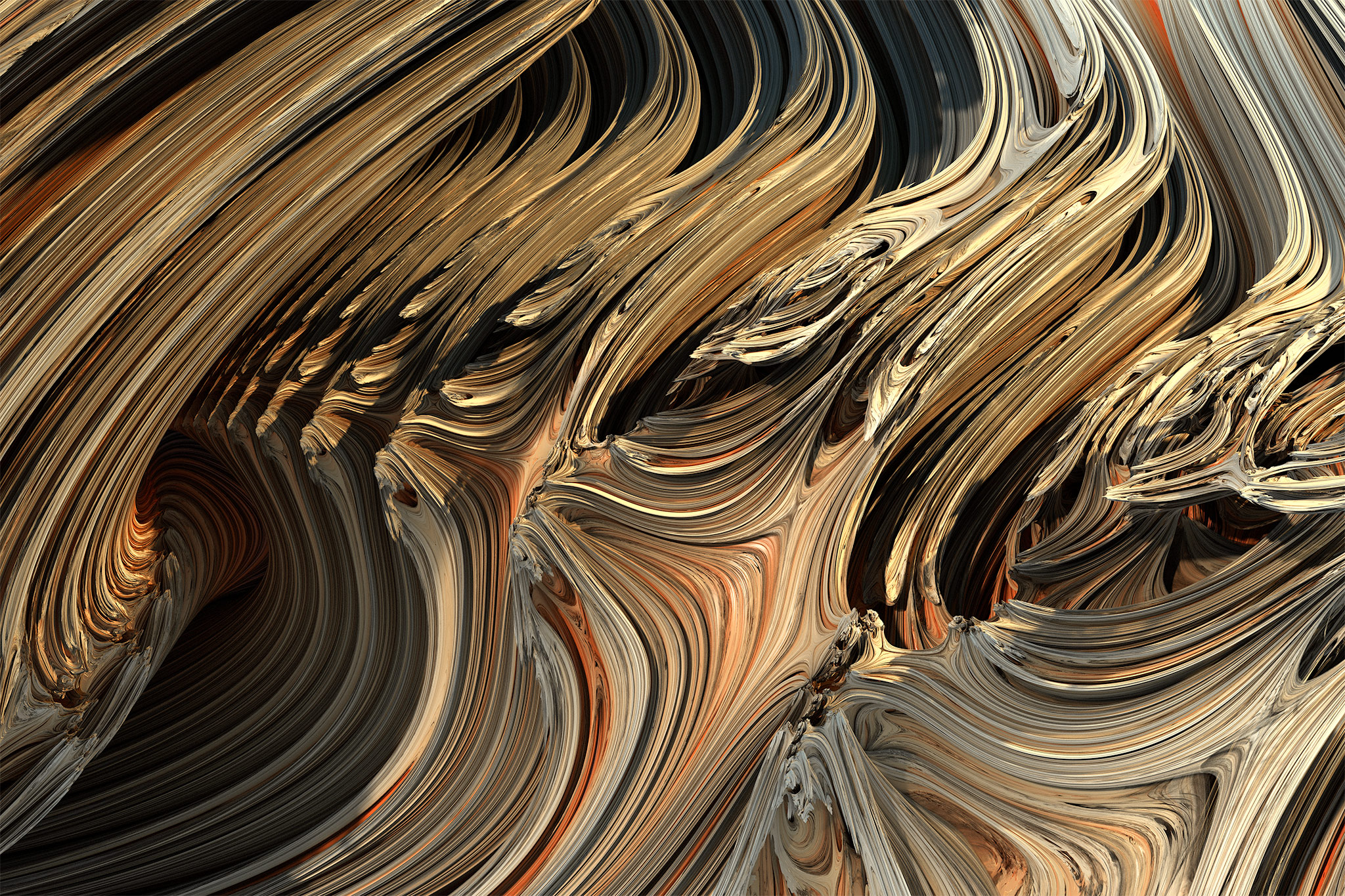
I’m no stranger to line art in Blender. While working on Perfect Restaurant, Aiken and I switched our entire film to Blender’s new (at the time) Grease Pencil line art modifier which allowed for smooth, uniform lines to be drawn overtop our characters from the camera’s perspective. Grease Pencil is an excellent and powerful animation tool but part of what makes it great is that it draws the strokes as 3D objects in 3D space — exactly what the vector displays and early 3D line art graphics that I wanted to emulate didn’t do.
Blender’s line art shader also wasn’t what I was looking for. Like Grease Pencil it sets its line thickness in 3D, and it draws the triangulated mesh, not the quads (which IMO detracts from the line-art look but your mileage may vary).
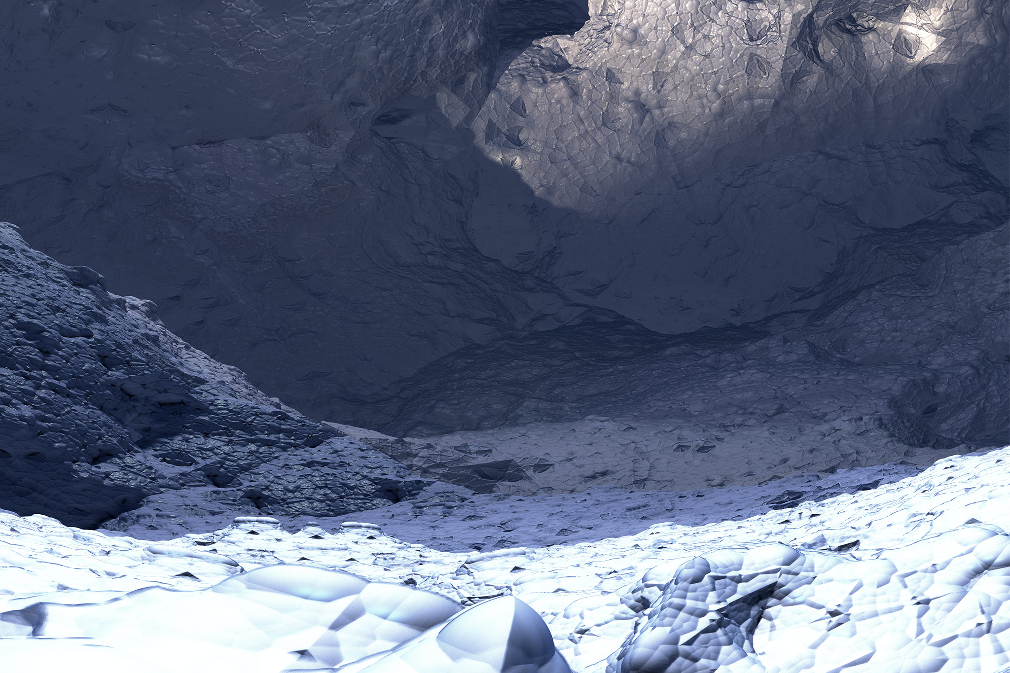
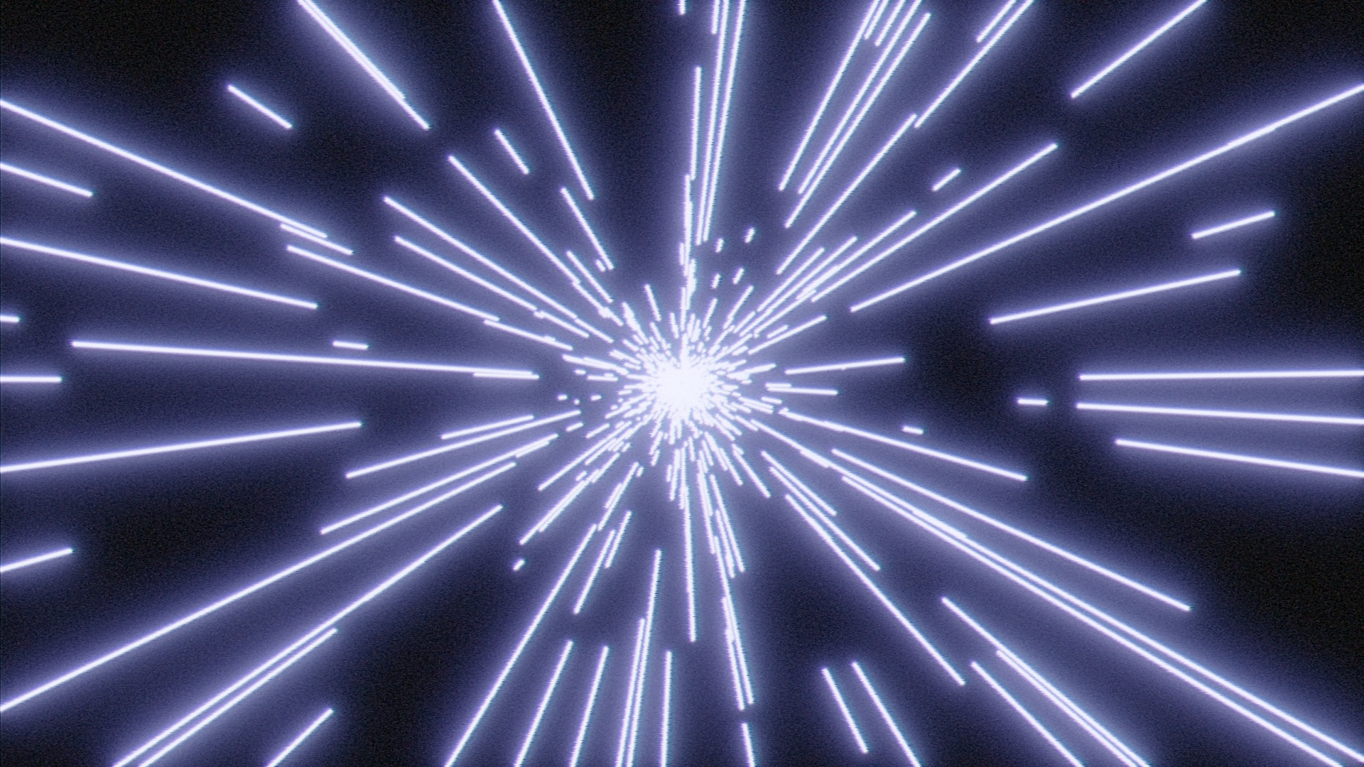
On the other hand, Blender’s Freestyle render pass draws its lines in screen space meaning that line thickness is determined in pixels and by default its lines won’t get smaller with proper perspective as the camera moves away from objects. Neat! Some optimization was required for the light-speed effect as Freestyle seems to struggle when you give it too much geometry to look at. It’s also currently single-core bound. With those small caveats accounted for however, I was very happy with the results it produced.
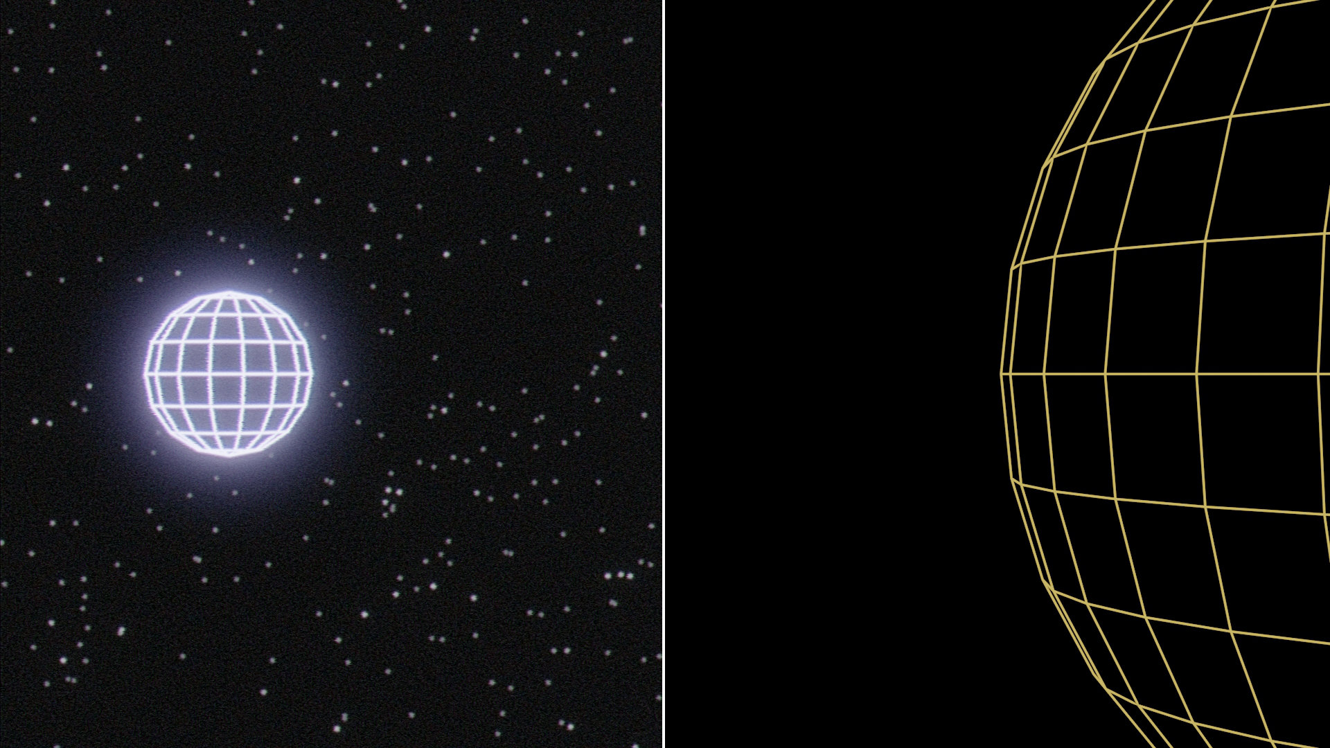
Final comp (left) vs Freestyle render (right). Stars were created in Nuke based on random noise.
Everything I wanted to avoid
I hate being the guy who throws other people’s work under the bus, but unfortunately the logo for Edgar Wright’s Last Night In Soho is a perfect example of every possible issue I strive to avoid when creating images with high intensity glows.
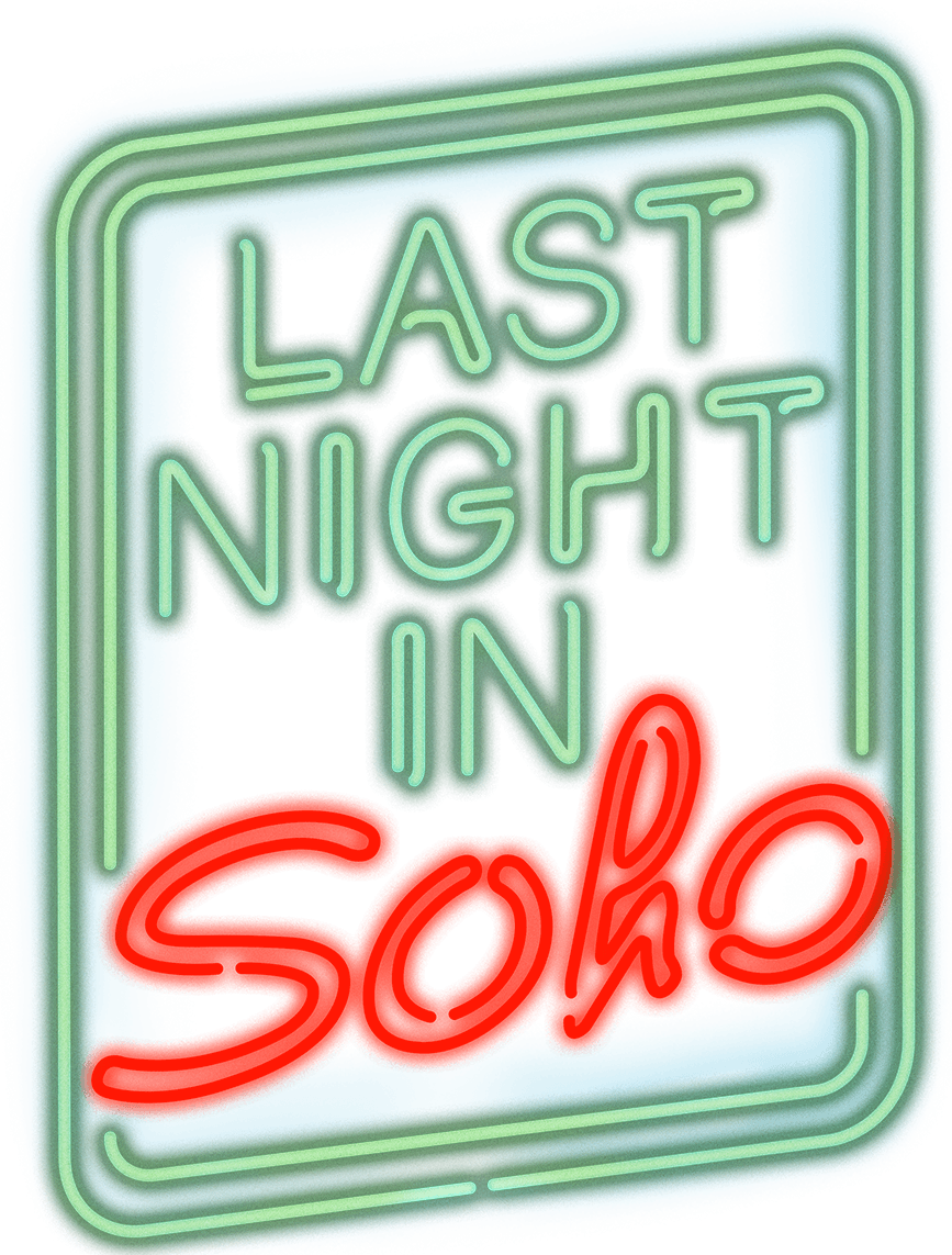
© 2021 Focus Features
There are three major mistakes here:
- The actual glowing light pixels have an alpha associated with them. Light has no mass and photons cannot occlude objects, they can just hit the camera sensor and produce a brighter pixel than any photons coming from objects behind the emissive point light source. On this website the “glowing” PNG is composited overtop a white background but we can observe here that the glowing light appears darker than the background itself! Why? We’re adding more light to the scene!? PNG is actually a broken model here as it is incapable of encoding a pixel where RGB has a value but A does not. Other formats like EXR and TIFF do not suffer from this limitation and any pixels where RGB > 0 & A = 0 will be added to the values of any pixels composited behind instead of composited with an alpha over operation. TL;DR: PNG is incapable of encoding a glowing object correctly. In order to do this the “right” way on the web you would require a PNG of the solid objects and another image format set to the “plus” blend mode that just has the glow effect over black.
- This was probably done in a program that deals with 8 or 16 bit integer pixels. The core of high intensity glowing objects is usually quite bright but sub 32 bit floating point colour is unfortunately incapable of rendering anything past its fixed intensity of 255 (white). 32 bit software however will let one blow past what is traditionally defined as “white” and enable the accurate high intensity core with physically plausible values. These high intensity linear light RGB values will then have to be compressed by a Display Rendering Transform to nicely fit into a colourspace and set of values that your monitor can display. This hasn’t been done with this image and as a result the glow effect looks more like a blur.
- The “Notorious 6” colour clipping problem that is created due to graphics programs not being configured to nicely deal with high intensity RGB values and fail to blow them out to white as they become incredibly bright. More on this below.
- As a bonus, the bottom left corner is cut off! Oof!
How I worked around these issues
After previous struggles with ACES and stumbling across some of its limitations I was pleased to have a chance to try out Troy Sobotka’s AgX config. As explained in Chris Brejon’s excellent article (linked above), digital RGB has a tendency to skew towards six hues: red, green, blue, cyan, magenta, and yellow. In most colour management workflows popular today, one cannot achieve a desirable “path to white” by simply increasing the values of a pixel, colours will often converge towards one of the aforementioned “Notorious 6” hues. Troy’s config attempts to mitigate this issue and in my humble opinion, does a great job of it!
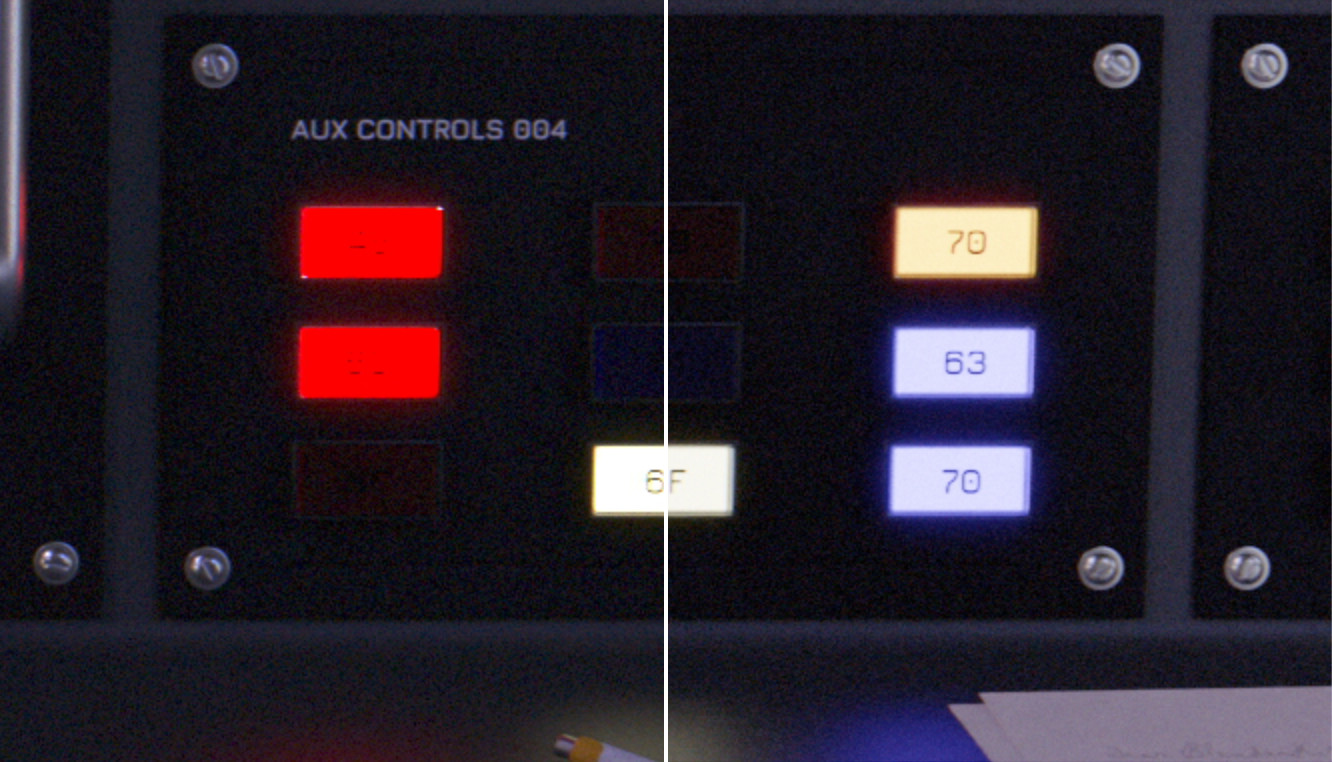
sRGB (left) vs AGX BT.1886 (right). This isn’t the greatest direct comparison but note how crappy the high intensity red glowing buttons look! The rest of the buttons looked like that too but in their respective hues.
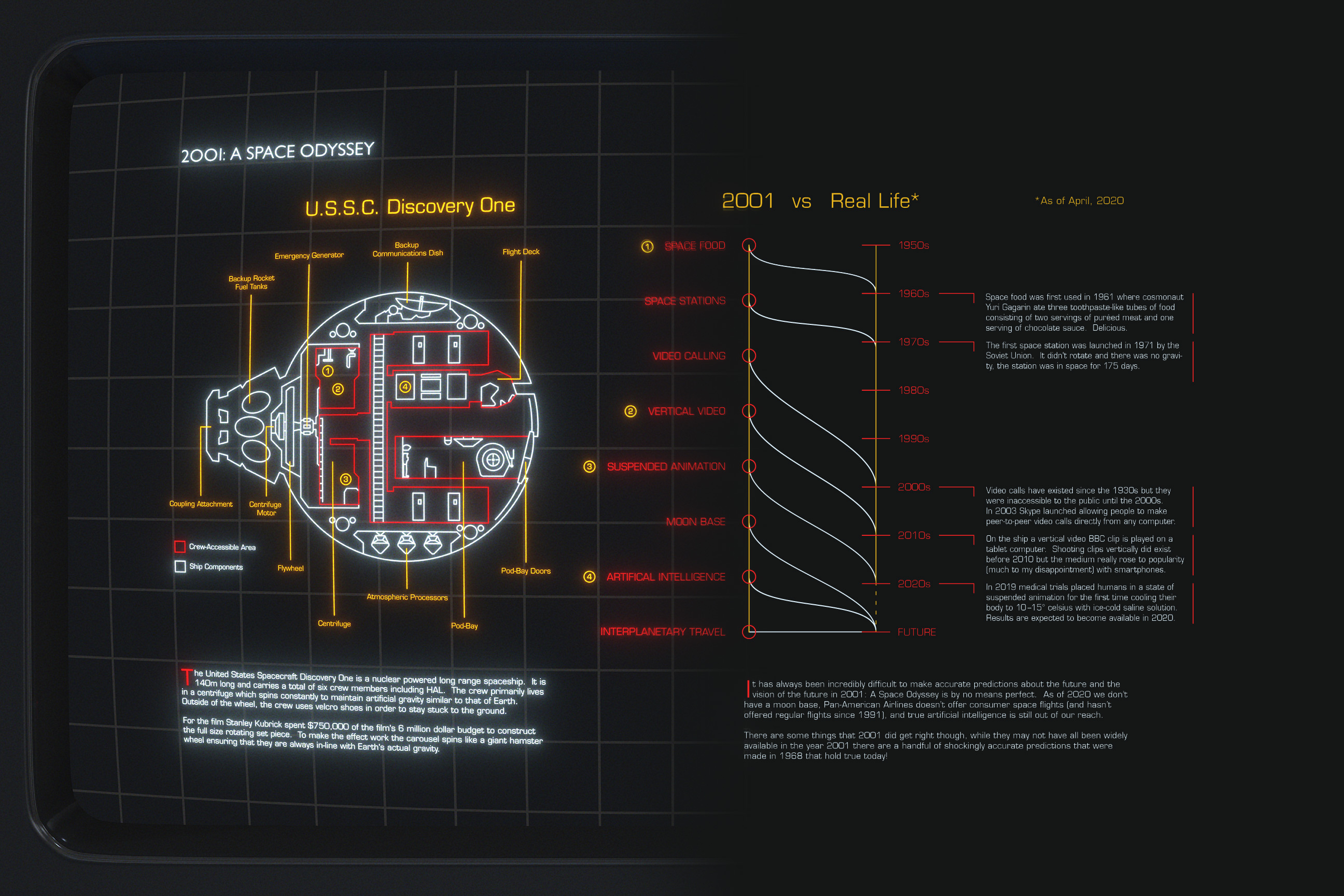
This is specifically one part of my pipeline for creating these types of graphics that I think changed in a subtle but valuable way. If you view my past 2001 infographic project you may find that while the white lines look pretty good, the red and yellow lines look kind of clamped by their hues and look a bit like the red buttons on the left in the image above. This artifact is no longer present when using AgX and while that look may be desirable sometimes, it can also be achieved in AgX with saturation adjustments or by selecting one of Troy’s predetermined “looks”. The important distinction being that it’s now a creative choice and not a technological limit.
]]>